Turning Checkout Friction Into More Completed Orders
Northline Apparel
Vancouver, BC, Canada — DTC eCommerce
18.4%
Increase in Conversion Rate
We helped a growing Vancouver-based eCommerce brand identify and remove friction across its mobile shopping journey, from product discovery through checkout.
The biggest opportunity wasn't more traffic.
It was converting more of the traffic the brand was already paying for.
18.4%
Increase in conversion rate
14.7%
Increase in completed purchases
22.1%
Reduction in checkout abandonment
11.8%
Increase in mobile conversion rate
The Challenge
Northline Apparel had a healthy flow of visitors coming from paid social, organic search, and returning customers.
But the numbers didn't line up.
Traffic was growing, while completed purchases weren't growing at the same rate.
A first look at the customer journey showed a familiar eCommerce problem: people were reaching the store. They were interested. Then they were dropping off.
The biggest leakage appeared between product evaluation and checkout.
"The store was getting the attention. The problem was turning that attention into completed purchases."
Our initial audit focused on three areas:
Strategy
Rather than redesigning the entire website, we focused on the highest-impact conversion leaks first.
01. Find the friction
We mapped the customer journey from landing page → product page → cart → checkout. The audit identified several issues affecting purchase confidence and momentum.
Key findings
- Important product information was buried below the fold.
- Mobile users had to scroll excessively before seeing key purchase information.
- Shipping information wasn't visible early enough in the buying journey.
- Product pages lacked strong reassurance around returns and delivery.
- Cart and checkout contained unnecessary decision points.
- CTA visibility weakened on smaller mobile screens.
"We didn't need to rebuild the store. We needed to remove the reasons customers hesitated."
Execution
Product Page Optimization
The product page became the first priority. We moved high-intent information closer to the purchase decision:
We also improved the visual hierarchy so customers could understand the product and next step without searching through the page.
Clearer purchase CTA
The primary CTA was made more prominent across desktop and mobile.
Earlier reassurance
Shipping, returns, and trust information were surfaced earlier.
Improved product information
Key product details were reorganized around the questions customers typically ask before buying.
Mobile-first hierarchy
The mobile layout was reworked around thumb-friendly interaction and shorter decision paths.
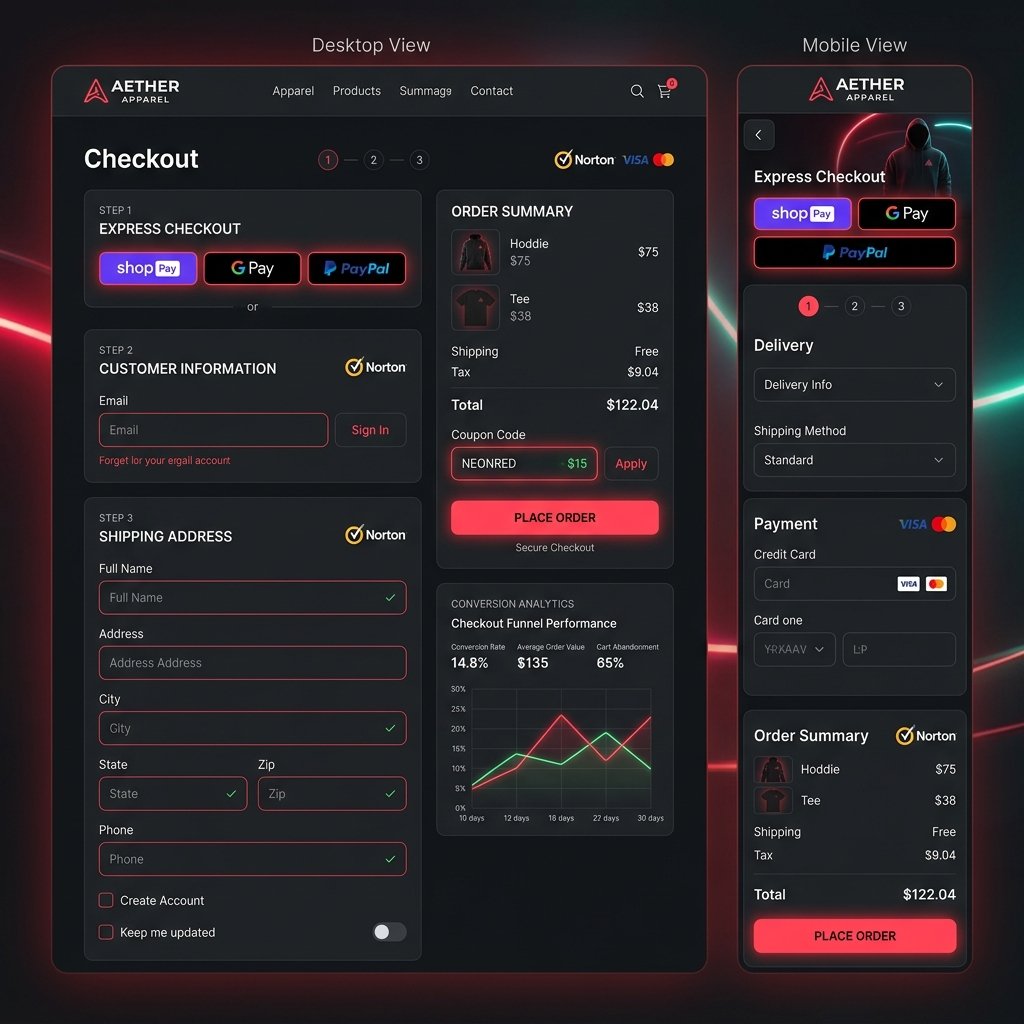
Checkout Optimization
The second major opportunity was checkout friction. The audit showed that users were reaching checkout but abandoning before completing the transaction. We focused on reducing unnecessary cognitive load.
- Reduced distractions
- Clearer order summary
- Stronger reassurance around payment security
- More visible shipping information
- Simplified form experience
- Improved mobile spacing
- Stronger visual distinction between required and optional information
The goal was simple: give the customer fewer reasons to stop.
Restacking the product page
- Product information↓
- Large visual section↓
- Additional content↓
- Shipping information↓
- Reviews↓
- CTA
Customer problem: Too much scrolling before the purchase decision.
- Product↓
- Value proposition↓
- Price + CTA↓
- Reviews↓
- Shipping + Returns↓
- Detailed information
Customer benefit: The information needed to make the purchase decision was available much earlier.
Mobile Experience
Mobile traffic represented a significant portion of total sessions, making mobile conversion one of the highest-value opportunities.
The optimization focused on reducing unnecessary movement and making important actions easier to access.
"Every extra step in a mobile checkout is another opportunity for a customer to leave."
Result
11.8%
Mobile conversion rate increase
The improvement wasn't driven by additional traffic. It came from helping more existing mobile visitors complete the journey.
The Outcome
After implementing the prioritized recommendations and allowing the changes to run through a sufficient testing period, the store showed measurable improvement across the purchase funnel.
| Metric | Before | After | Change |
|---|---|---|---|
| Conversion Rate | 2.71% | 3.21% | +18.4% |
| Completed Purchases | 4,286 | 4,916 | +14.7% |
| Checkout Abandonment | 69.7% | 54.3% | -22.1% |
| Mobile Conversion | 1.95% | 2.18% | +11.8% |
What changed financially?
$74,000+
Additional revenue during the measurement period
Assuming the store maintained approximately the same traffic volume and average order value, the additional completed purchases translated into roughly $74,000+ in extra revenue.
The key takeaway wasn't simply that conversion increased — the brand was able to generate more revenue from traffic it was already acquiring.
That meant better efficiency from existing marketing spend.
The Biggest Win Wasn't a Redesign
There was no need to throw away the existing store. The biggest gains came from identifying where customers were hesitating and addressing those specific points. Three conversion leaks made the biggest difference:
01.
Purchase information appeared too late
Customers needed important answers earlier.
02.
Mobile interactions created unnecessary friction
The experience wasn't designed tightly enough around mobile shoppers.
03.
Checkout asked customers to do more than necessary
Reducing friction helped more customers reach completion.
"The audit gave us a completely different view of where our customers were actually dropping off. We expected a redesign recommendation. Instead, we got a prioritized list of changes we could actually implement."
Marketing Director
Northline Apparel
More visitors don't automatically mean more revenue
A store can lose substantial revenue at every step between the ad click and the purchase. That's where conversion optimization matters.
Find the leak. Fix the friction. Measure the result.
Frequently Asked Questions
How did RedRuby increase Northline Apparel's conversion rate by 18.4%?
We achieved this lift by identifying and removing friction across the mobile shopping journey, focusing on cart page optimizations and a simplified checkout layout. Rather than redesigning the entire store, we restacked the product pages to surface delivery and trust information earlier, resulting in a direct increase in conversion efficiency.
What checkout friction points were resolved for Northline Apparel?
We identified and resolved three main leaks: late appearance of delivery/shipping information, hard-to-interact mobile layout forms, and excess steps in the payment checkout flow.
Why is mobile-first optimization crucial for e-commerce sites?
Mobile traffic represents over 70% of e-commerce sessions, yet conversion rates are often half of desktop. Optimizing for mobile ensures frictionless checkout and higher return on advertising spend (ROAS).
Ready to Find Your Conversion Leaks?
We'll audit your eCommerce website and identify the biggest opportunities — then show you where your store may be losing buyers.
Get My Free Audit- Mobile UX
- Product Pages
- Checkout Flow
- Page Speed
- Trust & Conversion Friction
How a HVAC Company Increased Qualified Calls by 25%